Acumen Fuse Dashboard: All Your Analyzer Data Dolled Up for the Big Meeting
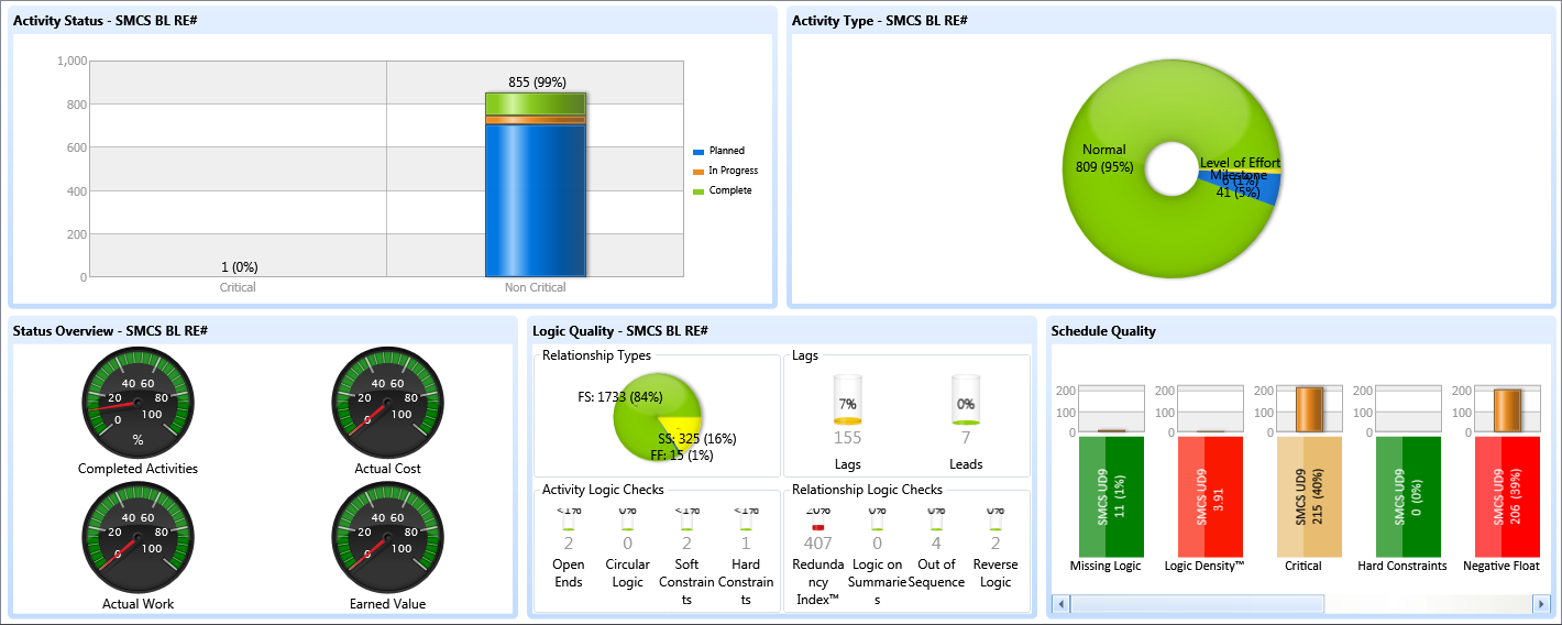
The Acumen Fuse Dashboard is where Fuse gussies up your analyzer stats into one, to as many as eight separate widgets on your screen. You might have a speedometer for activity status, a column bar chart for durations, and yet a pie-chart for logic quality, next to it. The analyzers for dashboard are mixed and matched into fourteen different layouts. All metrics are accessible with a scroll-bar. There is no operability in Acumen Fuse Dashboard other than layout.
A couple of benefits, aside from the obvious convenience: clients get bored looking at numbers, and tend to lose attention, whereas a 46” HD image on a screen of your Acumen Fuse Dashboard will have them (almost) running for popcorn. Acumen Fuse Dashboard is a great tool for visual side by side comparisons of different schedule versions that will be appreciated by the end-user. The handy-dandy Copy-to-Clipboard feature on the main task-bar sends your screen to be readily pasted, in fact, I am using it for this post. Think how spiffy these graphics would look in your narrative updates?
Executive Briefing
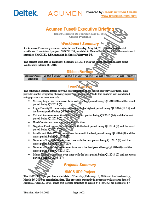
Fuse S2//Diagnostics tools includes an Executive Briefing publisher, which creates narrative updates using a hard-coded report (you can’t edit the boiler-plate text). You can pick and choose which fields (xml elements) to include in your export, and Fuse will load the values from your analyzers into your report. Of these, there are a surprising many, including
- Project Summary
- Activity Summary
- Ribbon Analyses for Metrics
- Cost Reporting
- Trending
Executive Briefing
You may like it, or not, but you can’t argue with Exec’s efficiency and accuracy.
Other Acumen Fuse Dashboard Publishing Tools
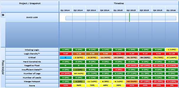
Publish to Excel is a handy feature that allows you to take analyzer and ribbon output and customize it to your liking for publication. A typical worksheet has a simple matrix. Thus, the example below, from the clip board
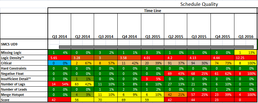
Becomes in an .xls export, with operability for filtering and layout management.
If I want all the metric analyzers in one report, I simply click the Analyst Report, which publishes the current ribbon view, in this case, about 9 metric tabs (columns).
Application Program Interface
The Fuse Application Program Interface
provides a rapid and simple way to communicate with other applications, sharing only the information that is needed and allowing the other applications to manipulate the data in order to construct custom reports, push the data to a web server, insert the data into a database, and so on.
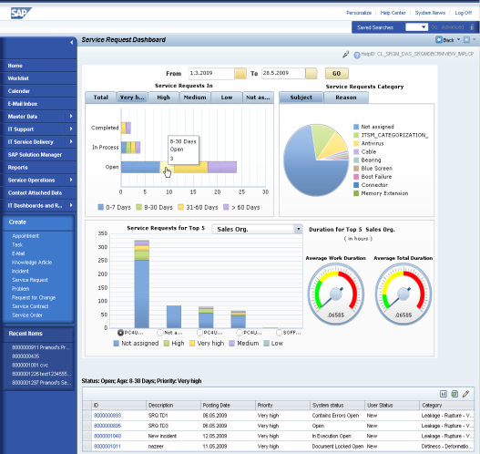
You may want to create custom reports using other programs with Fuse, or publish to MS Word, or even a website. Acumen likely has a script in its vast library. There’s even a section on how to use Acumen’s API to create SAP Crystal Reports, from which Dashboard is modeled.
SAP Crystal Report
Depending on your third-party scheduling software, you may need to get under the hood of some of Acumen’s API configuration files. Sounds like fun, doesn’t it? I had no need for it using Primavera P6 15.1 xers. Fortunately, Acumen uses the standard XML format used by most scheduling programs, and the guide is fairly thorough, though it will befuddle your average scheduler. Definitely get an IT administrator to help you with your API, if you go there.

